Monday, January 6, 2014

Creativity and Selfie Redux

Welcome to a new year and to a new semester.  I hope everyone is feeling refreshed from a nice vacation and prepared to enjoy creating some interesting new images.  So what better way to begin anew than to ponder the following question:  

What is creativity?

Joshua Hoffine creates images that reflect terrible thoughts.
We have probably all seen something truly odd and said, “THAT’s pretty creative!” meaning, it seems purposeless and generally inane. 

We even talk about “creative liars,” as if such a backhanded compliment didn’t besmirch the notion of creativity as much as it demeaned prevarication.

Creativity can in some circles be seen as an inferior substitute for disciplined hard work.  For instance, in finance, it is decidedly uncomplimentary to suggest someone has used “creative” accounting.

Erik Johansson collects digital material and re-assembles
it to create the image he has pre-visualized in his imagination
Another way of viewing creativity is to see it as the result of a great deal of disciplined hard work.  After all, in the arts as well as in more practical disciplines such as engineering or science, creativity means to create, to make something new.  At the very least, creativity involves taking parts and putting them together in a better and more effective, more pleasing way.  Very creative people actually invent new thoughts or objects.

And let’s face it, some people are simply more creative than others. They have more fertile imaginations, see things differently or express themselves in a way most of us can’t. 

Kirsty Mitchell can spend weeks assembling models' costumes.
See more about her art here.
But for all of us, no matter what degree of talent we bring to the endeavor, to be creative we must master our art.  A jazz pianist improvising sophisticated melodies and shifting through subtle harmonies has put in thousands of hours practicing scales and arpeggios.  A creative software designer making life-like figures respond athletically in a combat game has spent endless time writing computer code. 

So a creative photographer fully understands light and composition and the elements of design and the capabilities of her camera as well as the aesthetic responses of people looking at her art.  Currently, in the digital age, she probably also has real mastery of post-processing techniques.

It is one thing to have a “creative eye,” but without sound technique it is very difficult to communicate that vision.

Creativity is not a replacement for discipline.  It is the result of discipline.

Revisiting the Selfie:


In an earlier post, some were surprised to learn that selfies were as old as photography itself.  I have since had time to reflect on the fact that they are certainly as old as graphic arts.  It has made me wonder about selfies in cave drawings! Here is a very famous selfie, or as they were known in the day, “self portrait” of  Vincent Van Gough.  (He painted so many self portraits one wonders if he were not his own favorite subject).

And here is a selfie that proves they are not all trivial.  Astronaut Mike Hopkins worked with another crew member to share this pic.  Now this is a selfie to share on Facebook!

Friday, November 15, 2013

Perspective and Social Commentary


How often do you hear someone say, “It’s all a matter of perspective!” (Usually when their perspective on an issue differs from yours).

A camera is a powerful instrument for making a point about your own perspective.  Often when a photographer takes a very different point of view, it dramatizes the subject, whether the subject is nature, a wedding, a portrait or a social issue.  Some students in this course have presented images from very unusual points of view and their images “pop” accordingly.
 
Liz Moore shared with me these two images of the same cars taken from different perspectives. Above they look like real cars on a real street; on the right it is revealed that they are tiny models. They certainly make the point about perspective nicely.   (More of the same here.)

What is the message intended by this image?
Using a similar technique, compelling social commentary can be made without uttering a syllable.  This collection of images on flickr   addresses the notion that you can make effective social commentary simply by creating an image that brings together the elements of your insight and put them in the perspective you wish to portray.  It’s extraordinarily powerful.  

Surely that power should bring with it a responsibility – so another big question is the degree to which both mainstream and social media use this awesome power to act in a socially responsible fashion.  Many people objected to Rolling Stone Magazine portraying the Boston Marathon bomber like a rock star – of course the editors insist it is simply journalism.  What do you think?  What perspective could the editors have had?


click to see larger image
On the other hand, the German government has combined the great use of clean, simple images on the sides of vending machines with a wonderful sense of humour to make the point that education is the gateway to better-paying and more satisfying jobs.  No one could find fault with that social message.  In some countries it is hard to imagine a government with a sense of humour.


 Perspectives on Beauty

One of the most obvious false perspectives is one that greets our eyes everywhere.  Beautiful women are a delight to behold, so we rarely complain when we see them. The problem, of course is that the image of beauty created in those images is non-existent in nature, and it sets a standard impossible for any woman to meet.  Take a look at how the most ordinary-looking young woman is transformed into a fictional image of beauty.  This unrealistic portrayal of beauty cannot help but suggest to all women that they are falling short.  

Same girl after Photoshop
Ordinary girl before Photoshop


It is hard to believe it is the same woman in both pictures, but you can see how the transformation is made in the short youtube video.  Yet again, we see how photography is used to create an unusual perspective -- this time striving to create a fantasy perspective on female beauty that stirs the kind of anxiety that will sell cosmetic products (other than Photoshop).

A Beautiful Perspective
click for full size
click for full size
But my final word will be about one type of real beauty: the beauty of the natural world.  Here are some macro shots of snowflakes.  We have always been told no two are alike: what a rich field of images THAT opens up!  

And for your visual pleasure here is a page with many more delicate and beautiful snowflake pics as well as an explanation of how you can make your own.


Wednesday, October 30, 2013

From CERN to Selfies and Beyond


We have been taking photographs for about 200 years, and in the first hundred years of the technology we produced about a billion photos world-wide.  That may sound like a lot, but by the time I began taking photos in the mid-70's we had ten times that many.

The first image transmitted
over the internet (1992)
Astoundingly, for every single photograph that existed when I picked up a camera in 1970, we now have about 35 thousand images, and a recent estimate I read stated that we have taken around 3.5 trillion pics.  Reading these numbers got me thinking about what we're doing with that explosion in imaging power.


Currently, most of the world’s photos are on Facebook.  If all the images in the US Library of Congress covered a postage stamp, the images on Facebook would cover your living room floor.  And every month Facebook uploads another six billion! 

To return to my question, one thing we're doing with this imaging power is posting “selfies,” or photographic self portraits.  Made popular by MySpace and Facebook, you might have the impression that selfies are a recent phenomenon, but they date back as far as photography itself. 

Typical current selfie.
(Wikipedia)
 
Edwardian woman using
a mirror for a selfie in 1890
Today, typical selfies are poorly-lit self portraits of girls and young women (females seem more smitten with this activity than males) taken in a bathroom mirror.   Ironically, this year a study showed that posting too many Facebook selfies can hurt your real-world relationships: it is NOT an activity that leads to popularity.  

It is apparent, however, that selfies are a permanent and growing feature of the photographic landscape.  What is your opinion of selfies?  Why do people post them?

The Breathing Earth uses graphics to present information powerfully.
To be less cynical, here is a more uplifting way that we are using the power of imaging:  The Breathing Earth is a simulation web site that will show you in real time as people are born and die around the world.  It is one thing to read that many are born in Africa every minute -- it is a much more striking thing to see the sparks of their births on a map.   Even if you just watch it for one minute, you will be fascinated. 

Dean West
Finally, to end on an aesthetically more satisfying note, let me introduce you to the fun and engaging work of Dean West.  A small-town boy who grew up in an Australian mining village, he went on to take a university degree in photography, and at 30 years of age has earned many international awards and is considered one of the most important emerging photographers today.

"20 Thousand Leagues Under the Sea" required hundreds of
images, including many of both live and dead octopuses.

Many of West's works seem to evoke mythology.
His images have been called "hyper-photographic realism," but to me they simply look surreal the way Salvador Dali's work does.  He takes hundreds of photos as raw material and reassembles it in images that have the resonance of mythology.   

His work flow begins with a 60 MegaPixel camera and moves to Photoshop.  Though he has a soft spot for film he says, "Digital photography has made the impossible possible."  

Check out his web site.

Sunday, October 6, 2013

Photography Bears Witness

“Photography is a weapon against what’s wrong out
there.  It’s bearing witness to the truth.”   Brent Stirton

In a recent blog I talked about photography as a tool for social justice.

I introduced the work of Lisa Kristine and her efforts to publicize the blossoming of human slavery in the 21st century.

I’d like to hit this theme again, as it is possibly the most important role of photography in our culture.

Nothing brings home the truth of this more than the work of those brave individuals who bear witness through their photography

For instance, the October 2013 issue of National Geographic points out that the minerals in our electronic devices have bankrolled unspeakable violence in the Congo. 

But it was the black and white photography of Marcus Bleasdale that brought alive the horror of a society torn apart by greed and violence, and gave the term “child soldier” a chilling resonance.  

Take a moment to look at those two images; ponder the faces.


Steve McCurry

Most famous for his “Afghan Girl” cover on the June 1985 National Geographic, Steve McCurry has been responsible for creating many of the most iconic human images in our culture.


You’ll often hear the phrase “the human condition.”  No one chronicles the breadth of that notion better than Steve McCurry.

Intrigued by disappearing cultures, by conflict, and by ancient traditions as well as contemporary culture, McCurry creates images that expand our sense that we participate in a broader world -- one in which there is much room for compassion.  His photography can elevate your spirit.  It can also coax tears.

The tears in this little boy's eyes, the size of the handgun against his little pre-schooler's head, his general look of sorrow and neglect: it would be a stoney-hearted individual who did not feel compassion.  

But do images such as this engage us so deeply they motivate us to act, or are we inured to them, numbed by the simulated violence that saturates television?  


Keeping in mind our theme of social justice, this week’s question is:  If you were offered the opportunity to travel on assignment as a National Geographic photographer where would you choose to go, and why? 


Saturday, September 28, 2013

In the Abstract

Welcome back to another school year.  I hope some of these blog entries can inspire some thought -- and perhaps add an element of visual pleasure to your studies.

In this entry, I'd like to look at the notion of Abstraction


Munch says the red sunset inspired him
When Norwegian painter Edvard Munch picked up a box of pastels and a piece of cardboard, he probably did not know the resulting image would fetch almost $120 MILLION dollars at auction about 100 years later.  This is the highest price ever paid for art at auction – higher, even, than for any of Picasso’s work.

The Scream is one of the most recognizable paintings in modern art and has even been stolen from museums (and recovered) twice.  Kind of reminds a guy of The Thomas Crown Affair.

Clearly, this is an image of huge power to communicate.  Yet it is barely representational at all – nothing in it looks realistic: not the shapes, the colours, the face.  My question to you is two part:  where does the power come from, and is there any way to use a camera to produce images with such power?

ABSTRACTION
You doubtlessly remember the first assignment in this course – to analyze your own images in terms of line, colour, form, pattern, etc.  Abstract photography concerns itself entirely with these dimensions.  It’s a nice discipline to focus on these elements entirely – creating an image of shape, for instance, rather than a snapshot of a building.

Here are some ways in which a few photographers have taken such common subjects as smoke and water and found in them all the elements of art.  Can you identify which elements of style dominate these images?

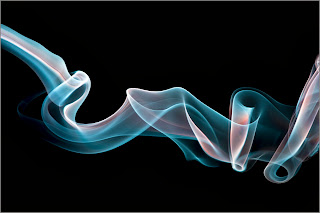
Paul Bonnichsen has made good use of those long dreary days of winter with poor light outside to stay inside and make fascinating images of smoke curling from incense sticks.  He has had to put a lot of effort into rear lighting, yet the results capture our eye.


Chaval Brasil (who you can find in flickr) uses design elements in all of his work -- but his water splash images are perhaps his most abstract.

Which elements of design dominate these images?  Can you find and focus on them them in your own images?


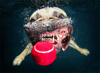
Finally – just for fun – here is a photographer who has combined images of water and dogs.  It demonstrates wonderful technological skill while communicating a real sense of play.  Seth Casteel is a “lifestyle” photographer with enough fame to appear on Duck Dynasty, but he began his career volunteering to photograph homeless pets.  Who knows what your own future might hold!

For now, just take a moment, look back up at The Scream, ponder it and see if you can put into words the source of power in that image. 

Add  your insights as a comment -- and we'll see if we can better understand why some images have such enduring power to engage the viewer.